


From Terex Trucks to Rokbak – A year of rebranding
Ever wondered what goes into launching a new brand? Jacqueline Reid, who led the team behind the award-winning Rokbak rebranding project, reflects on a successful first year and tells all about the renaming process – from how it came about to why it was needed.
It’s been just over a year since the strong, modern Rokbak brand entered the market – but it was about three years earlier that the team started working on the project. “In 2018, we did market research with current and previous customers, in markets where we were doing well and in those where we weren’t so successful,” says Jacqueline Reid, Global Director of Marketing Communications & Product Management. “We discovered that some legacy issues had left a few unpleasant memories with customers. They no longer thought of Terex Trucks as a brand for today, so it was clear we had to do something.”
Jumping forward to the AED show in January 2022 – just over four months after the launch – and everything had changed. “That was a real highlight for us,” says Jacqueline. “Dealers were approaching us excitedly to represent Rokbak. For them to come to us and be so positive was a massive endorsement.”
Existing dealers had expressed similar sentiments right from the September 2021 brand launch, which produced lots of positive coverage in both the construction press and on social media. Pride and engagement rocketed back home in Motherwell, Scotland, too. “I think legacy problems had left some of our team feeling a bit flat,” explains Jacqueline. “One of the sales team hadn’t been 100% convinced on the rebrand but, after we launched, he could barely contain his excitement about all the emails and calls he was getting. He said, ‘I feel so proud standing behind the product!’ – that was amazing for me to hear. Another highlight was the positive feedback we received from dealers, customers, visitors and other manufacturers at Hillhead – everyone was saying that our haulers were the best-looking pieces of equipment on site!”
It’s what’s on the inside that counts too
Of course, it takes much more than a new look to achieve this level of success. The rebrand followed huge investments and technological improvements after Volvo Construction Equipment’s (Volvo CE’s) acquisition in 2014.
In fact, reviving a Volvo Group legacy brand, or joining another brand’s portfolio, was an initial consideration when it came to renaming the company. But ultimately it was decided to use a new name, with something that would reflect the legacy of both companies being the initial angle. “We thought about our heritage, Volvo’s core values and reflecting what we stand for,” continues Jacqueline. “We came up with 250 potential names, many from Scottish Gaelic and Scandinavian sources to reflect our roots. We narrowed that down to 52 words, and then got a historian involved to provide more detail on each word before it came down to 12 and then the final five.
“We put an image board behind each name to see how we could make them work – for instance, SKOT, reflecting both the Scottish and Scandinavian elements, was all about black stallions. But there’s a company with a similar name, so we decided against it. Then there was STARK, like in the Iron Man films – that would have changed perceptions, but wouldn’t be ideal for search engine optimisation (SEO) purposes and, as an English word, it obviously has a meaning behind it.”
One of the other final options had no such disadvantages – ‘Rokbak’ came entirely free of legal baggage and was a completely clean slate in terms of SEO too. Workshopped alongside images of strength and true grit, such as rocks and strong backbone, the brand’s direction soon became clear for all to see.
“I was passionate about the name Rokbak – it was a strong, rugged word that represented our company,” says Jacqueline. “I could imagine how it would look and feel and what the merchandise would look like.”
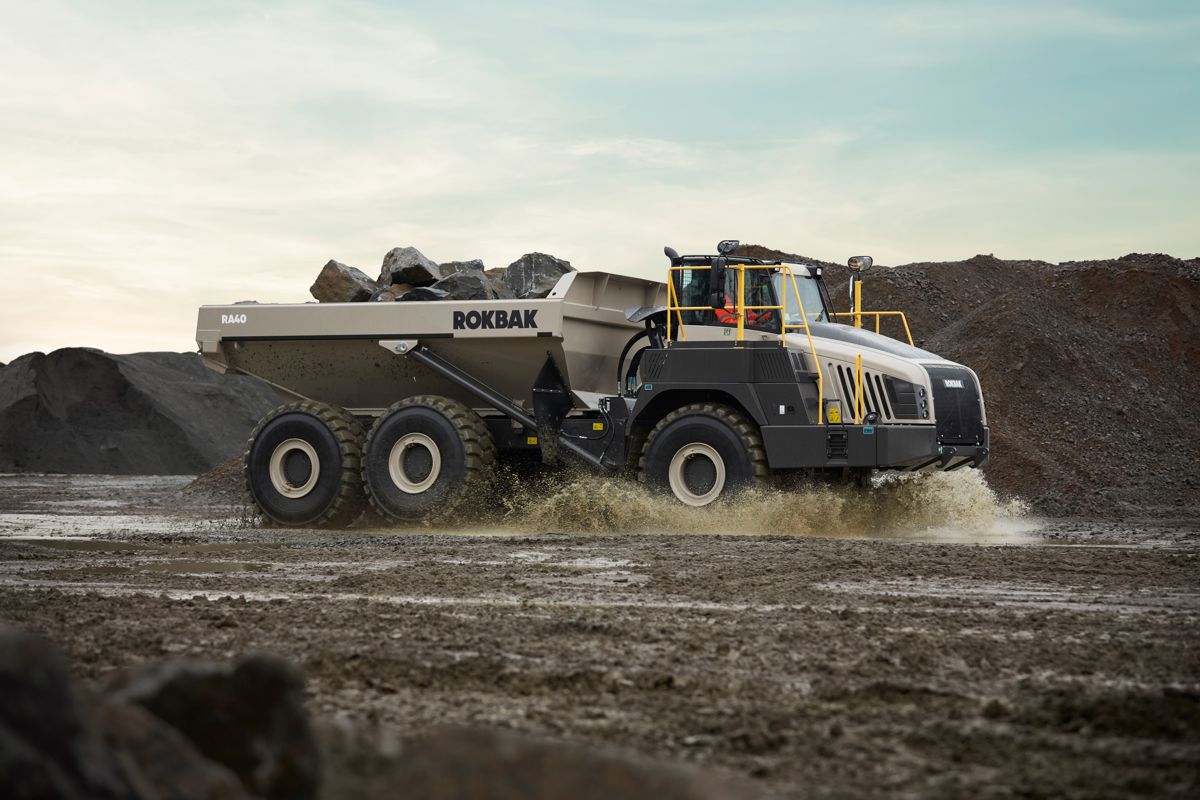
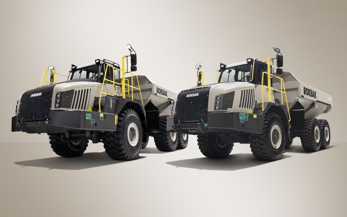
A unique colour
Finding a new colour scheme to reflect the new brand was another challenge. Many people appreciated the Terex Trucks white paintwork for its uniqueness in a sea of yellow and orange competition. The team were keen to maintain this differentiation by avoiding some of the industry standard colour palettes, originally looking at variations of greens, oranges and blues, before the Sand suggestion gained traction.
“We worked with Volvo’s product design team to come up with the Sand-colour,” says Jacqueline. “The first time I saw it on the iron I was blown away – it really came to life. It’s not a huge jump from white, but it’s distinctive, clean and modern, with great gloss levels.”
There was also a lot of administration work required for the rebrand. “We had to be mindful of legal requirements from IP to contracts, and carefully align timings – much of this was done while working from home due to Covid lockdowns,” continues Jacqueline.
Inevitably, the pandemic impacted the launch event too, which had to be held online. “With the launch being digital, I was worried people might not tune in,” admits Jacqueline. Those fears proved groundless, of course, with 600 invited guests in 22 countries watching the launch and feedback throughout the past 12 months providing more than enough proof that the years of research and testing were well worth the effort.
A strong, modern brand
“People recognised we’d needed to embrace a strong, modern brand to reflect everything that had changed over the previous seven years, but our heritage is a massive element that we mustn’t lose,” concludes Jacqueline. “There’s a long line of experience within the team, and that reflects the huge amount of passion and pride that was at the heart of this. I am exceptionally proud of what we’ve achieved together.”
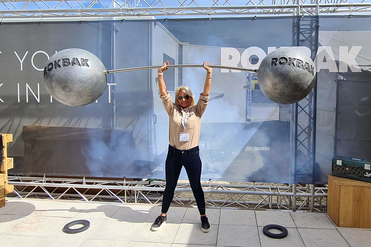
The rebranding team’s hard work was officially recognised by those outside of the construction equipment industry throughout the year. First came the CeeD Industry Awards in February, then the company took home five Marketing Society Star Awards – which included Jacqueline being named Inspirational Marketing Leader of the Year.